Content Inventories & Sitemaps
The existing content was added to an inventory for evaluation.
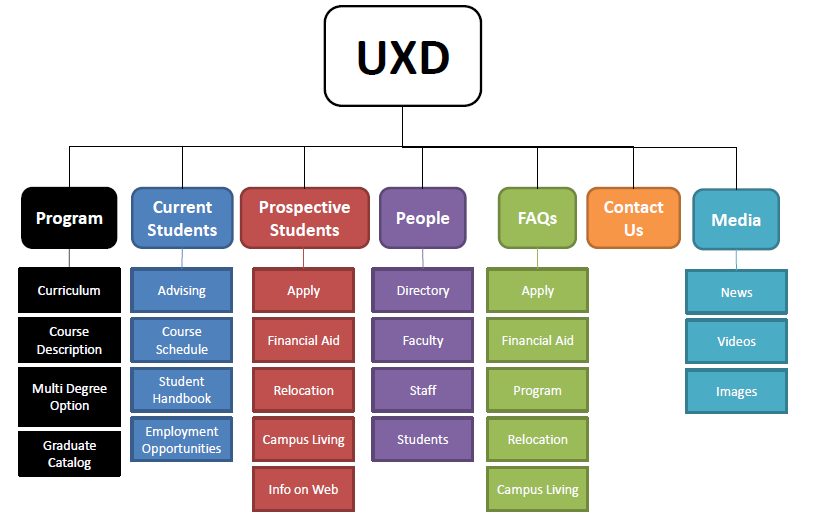
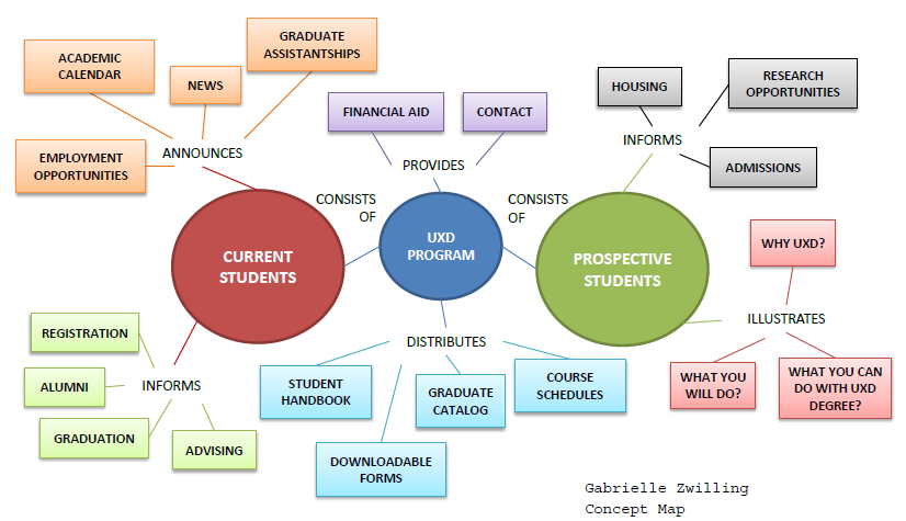
Here is a very high level sitemap for the existing content and future content.


My team and I incorporated the K.S.U. IAKM LUMEN Model into the K.S.U. registration system redesign - see the illustrated steps we took in the planning process. Our team also was responsible for deliverables - concept maps, competitive review, sitemaps, content inventories and process flows, etc - for the redesign of the UXD concentration within the IAKM graduate program.
The project was researching the site and the user, implementing those changes, evaluating the site's performance and then informing stakeholders of the outcome of the redesign.
The Kent State University Registrar’s Office site provides students with an online system to enroll for their courses each semester. The office has received negative feedback from the students pertaining to their site’s design and functionality. Currently, it is not serving as a user-friendly site for the students to enroll in their courses. Also, it’s not very “fun to use” nor does it have the modern look and feel that the students desire.
Method 1: Interview User feedback is driving this project. The students want a more “modern” feel to the site and a “fun to use” interface. Interviewing gives the researcher the opportunity to dig deeper. One-on-ones are beneficial in collecting unbiased data (Wilson). Interviews with existing or potential users are essential in understanding individual’s preferences and attitudes (52 Weeks of UX). They will not only provide insight from the students’ perspective, but from the registration department (what questions do the students have in using the system). Sample Items
The process would take approximately 2 weeks. I would post a want ad in the Kent Stater for “Paid Interviews” to solicit a random sample of students. I would close the study at 25 students (ideal representation from the population). This would not draw out the research process, but provide a reasonable sample representing the typical user. I would also pull in members of the Registration Department staff. |
Method 2: Observation This is the most valuable input in the research process. The users can be observed while utilizing the system in their natural environment. This method would provide the richest data. The students would be in action which allows the researcher to see firsthand what is stopping the user from achieving their goals with ease. Sample Items
The first 2 weeks would be split between interviewing and observing. The KSU computer labs would be a good place to recruit users and observe their behavior. |
Method 3: A/B Testing The negative feedback of the site’s design is driving its redesign. There is a need to understand what is aesthetically pleasing and easy to use for the target audience. The best approach is A/B which tests the effect of the site’s design on user behavior (Rohrer). It will also help the researchers to identify the elements that consistently tend to produce the greatest improvements. Sample Items
A/B Testing will take place during the first month - as the designer works through mockups and after interviews and observations. 25 participants between students on campus and in the department would have to be recruited. The testing would have to be performed in a usability lab. |
There were quite a few universal complaints with the KSU student registration site.
The systems should be improved in the following ways:
“I need interactivity, personalization and guidance within a system.”
Andrew Smith is a sophomore at Kent’s Main Campus. He works full-time and commutes around an hour to main campus. His tight schedule gives him minimal free time. He prefers to schedule on his own without an advisor as it is just not feasible with his unavailability during business hours. His courses have to take a back seat to his job which is his only means of financial support.
Andrew is a CIS student. He transferred from his local regional campus as it did not offer his major courses. He’s unwilling to give up his CIS program to stick with the regional campus. He has limited use of the system and has to adapt to the new environment of main campus – both of which make him uneasy.
Andrew is awkward and shy around new people. He prefers working alone. He limits contact and avoids confrontation. He keeps to himself on campus and prefers not to meet with any advisor unless it’s absolutely necessary. He attends classes, keeps to himself and goes home. He lacks the social environment which living on-campus would have provided him.
He benefits from the time conflict error in the system which helps him to realize which 2 courses overlap and would not fit into his schedule. It leads to making a choice which course out of 2 that fits his schedule is more important. The time conflict error is helpful, but nothing frustrates him more than the K.S.U. registration site pre-requisite errors. They create anxiety over having to contact someone due to his exceptionally passive behavior.
Andrew has many interests, but computers are his passion. He lives, breathes and sleeps technology. He keeps up with all the hot trends. The subject matter is quite extensive – leaving a wide variety of options for his career.
He’s just not quite sure what path to take and has had an especially hard time committing to one direction in his program. He can’t make up his mind about which courses most suit him. Browsing courses for exciting new possibilities to fit his interests consumes him and causes anxiety about his possible future. He changes courses tons of times before the semester begins to fine tune his schedule and gets up early to ensure he does not lose his spot in a desired course.
Andrew does everything on his own. If he’s new to something, he submerses himself in the topic until he’s knowledgeable in that area. He works to support himself. His decision to go to college was his own and his decision to pay for his education was his own. He prefers scheduling on his own to meeting with an academic advisor – he does not want to be dependent on anyone else.
Reason: Don’t Make Your User Think! The user should not even have to think twice when performing the tasks to reaching their goal. The results from the user research confirmed the users’ confusion with the current site which needs to be resolved.
Reason: To provide the ideal registration system for all users (undergraduate, non-traditional, disabled, graduate). Everyone needs to benefit from the redesign. The results confirmed the substantial proportion of the student population who wear glasses.
Reason: To provide the “fun to use” online experience to the students. From the interview results, the majority of students answered “No” to the question “Do you enjoy it?” The students will be more receptive to the redesign if they can enjoy it.
Reason: The majority wanted access to their program requirements while scheduling – a list of required courses and a fill-in-the-blank weekly schedule could provide a more valuable experience. Most students use pens and paper while scheduling – the notes section would provide them with a digital notepad to assist in the process.
Reason: The students had major complaints about the system errors. The system should be reprogrammed to recognize the student’s degree program and their progress. An intuitive system would significantly decrease the academic advisor's workload while eliminating unnecessary advisor visits for the students.
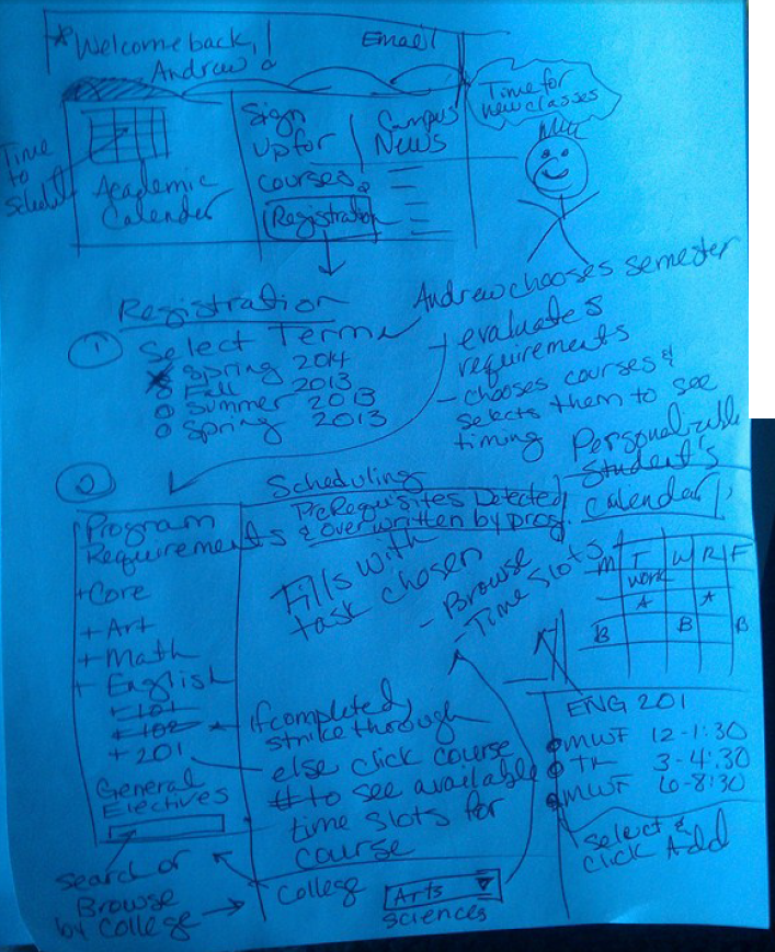
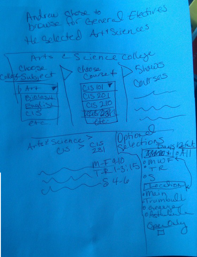
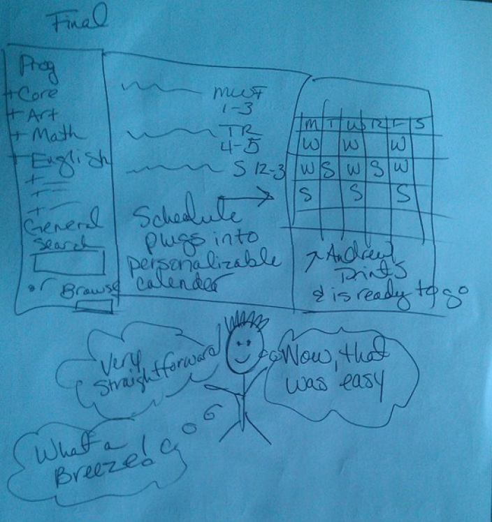
Here are several sketches of Andrew's journey through a my "imagined" registration process.
Here is our team's evaluation of the KSU Course Registration site in its current state.
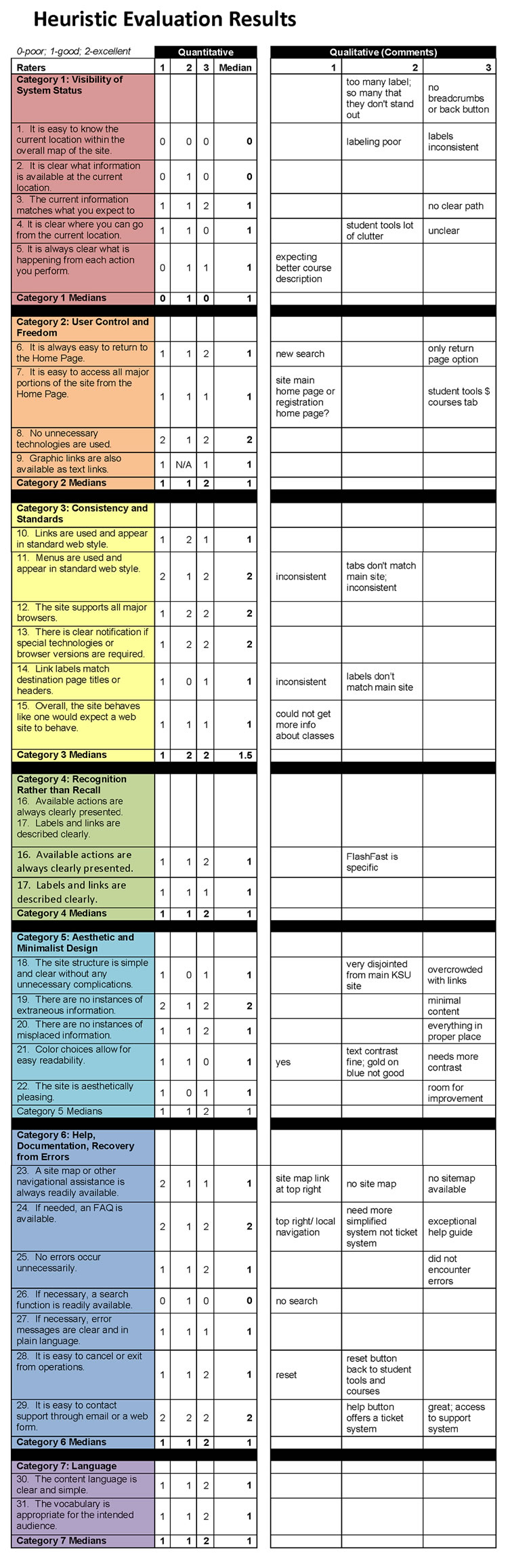
Our Heuristic Evaluation Report for KSU Registration System summarizes the project in a business format for the intended audience.
This report provides data from an analysis of competitor websites at other higher education institutions with programs similar to KSU's UXD program. The competitors under analysis include of University of Baltimore vs. Parson's Interactive Design Graduate Program
Criteria to analyze to identify the trends:
| Criteria | University of Baltimore | Parson's |
|---|---|---|
| Labeling |
Admission Requirements Degree Requirements Faculty Apply Now None |
Admission Requirements Curriculum Faculty Apply Today Alumni |
| Navigation | Home | Graduate Programs and Certificates Degree Programs | Interaction Design and Information Architecture | Academics | Graduate | Design and Technology |
| Content | How the program works on the home page. Student's testimonies about the program. No social media. | How the program works on the home page. Student's work sample in videos. Highlights of the program. Connect (social media). |
| Search | None | Yes, entire school |
The existing content was added to an inventory for evaluation.
Here is a very high level sitemap for the existing content and future content.
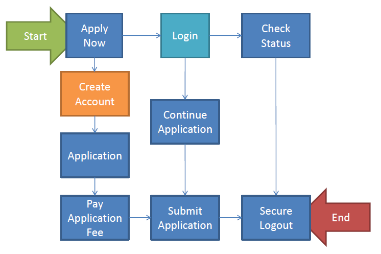
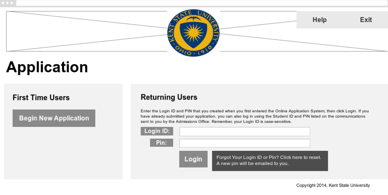
The user begin the application process to the UXD page after visiting the prospective students page and clicking on Apply Now. A new user would be able to create an account from this page or an existing user could login from this page. The system will allow the user to create a new account and begin the process or continue the application where they left off, or even check the status of a submitted application.
There is a definitive starting point upon the entrance to the Apply Now page and a definitive ending point upon a secure logout. The progress of the application is indicated throughout the entire process.